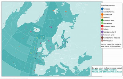
Both are dynamic - you can interact with them. Click on the pictures to try them.
The first #visualization shows the fish trade in US dollars between 2004 and 2015.
The second is a map that shows where the different fish species from the North Atlantic are caught.
Enjoy!
Sorry our main website is down whilst we try and fix it. Until that time http://cfpm.org is redirected to here.
23 July, 2018
19 July, 2018
Sorry, our main website is down...
... for the moment we will redirect http://cfpm.org to here. "Normal service will resumed as soon as possible". Meanwhile here is a picture of Ruth showing what she thinks of the situation.

Subscribe to:
Comments (Atom)


